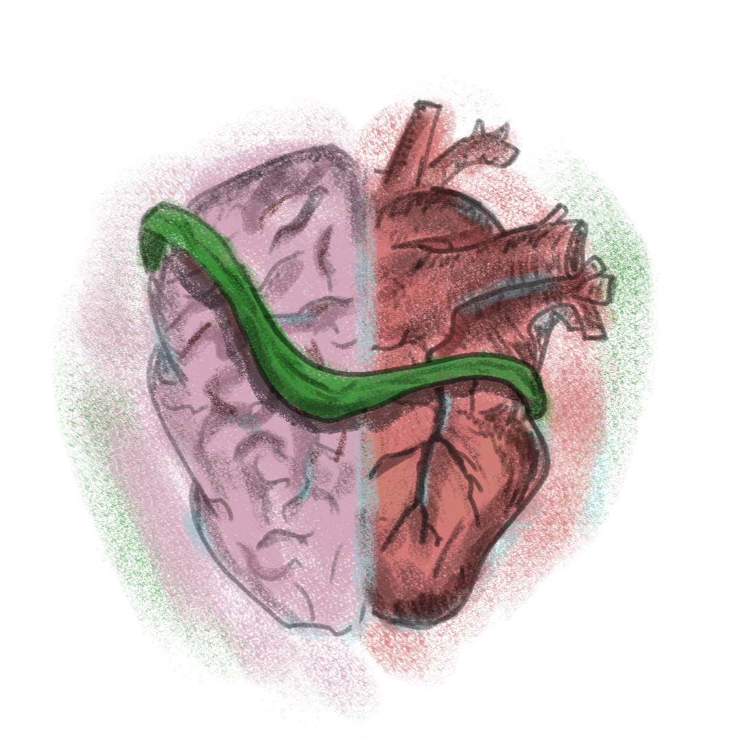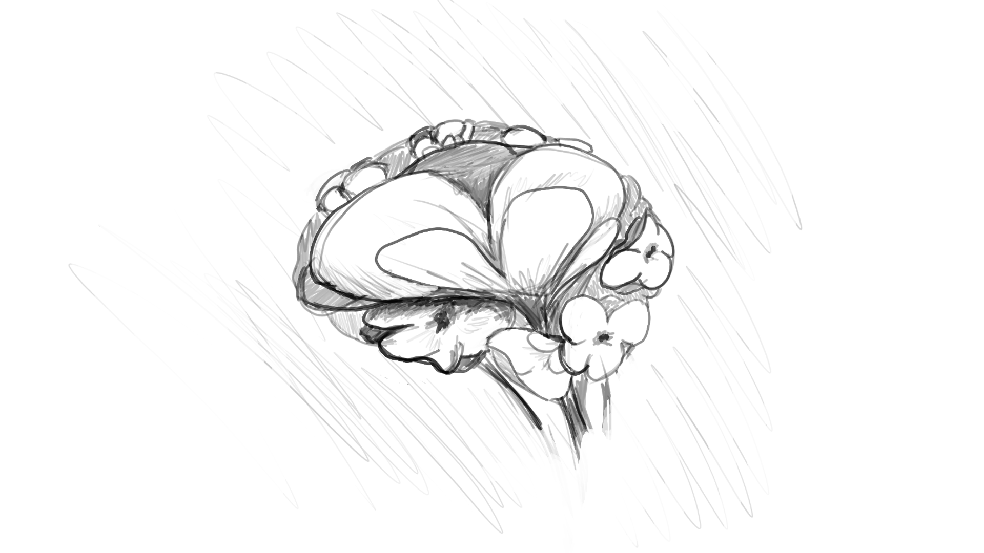

This is a logo done for a psycho-therapist (@joanavieiraferreira.psi). They approached me with the ideia of having a logo that included but the heart and the brain as well as flowers. Due to the limited time and the busy schedule I was in when I got approached to do this logo, not to mention this was also the first type of commission work I had ever done, there was not a lot of time to experiment with different ideias and concepts. I ended up trying different types of flowers and mess a little bit with the colors to make the overall design a little warmer.
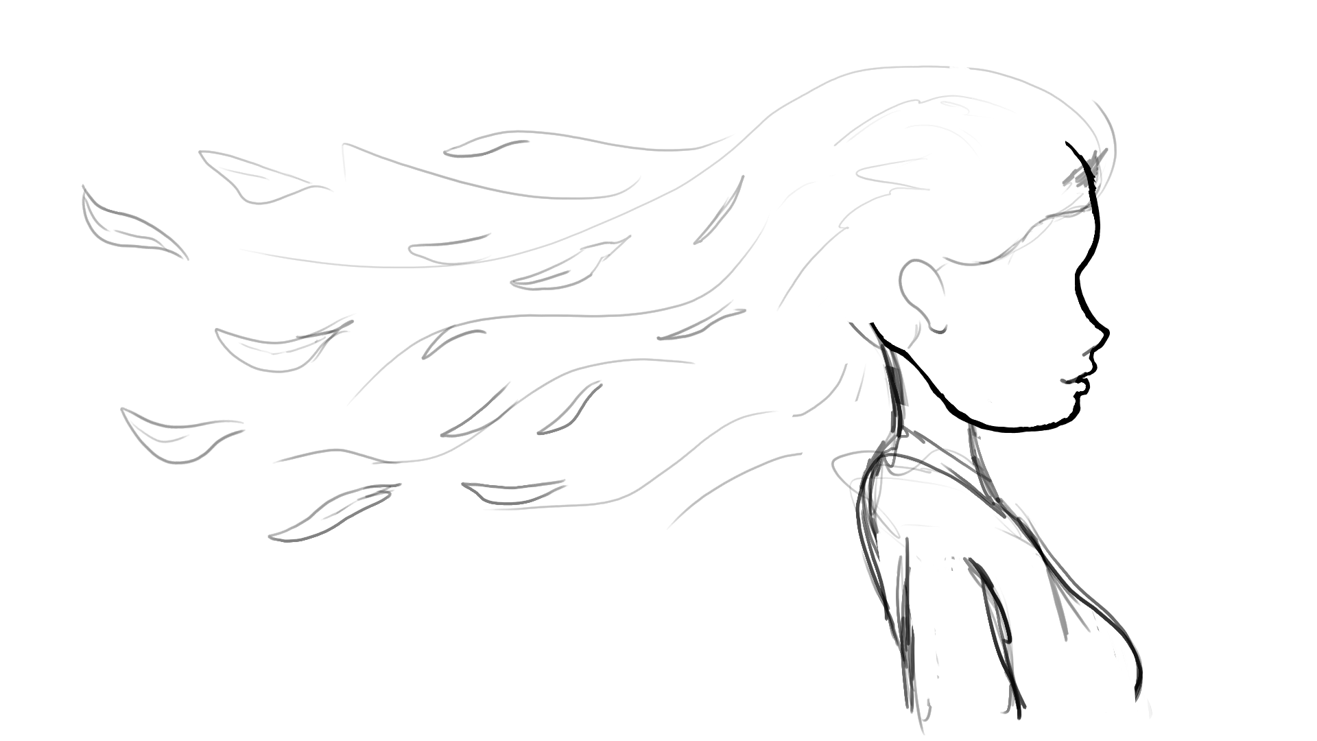
This was done as part of various promotional social media posts, for "PsiValor", a psycho-therapy clinic, based in the Leiria district, in Portugal and created by Andreia Azevedo. This particular work is a part one of two, for story I was asked to write, draw, animate, edit and sound design, under the loose and freeing directions provided by Andreia Azevedo. It was and still is, a fun project to work on without unnecessary pressure on the client side and freedom in the way I present the ideias they ask for.
Another, more simple work, done for the social media pages of "Psivalor", this time done only in Lunacy for the assets and in after effects for the animation and editing. I tried to create this one in a way that would allowed it to be modular and easy to change to get different iterations fast, without compromising the quality necessarily.


A logo done for a psycho-therapist (Beatriz Silva Rodrigues). This time I was able to experiment a little more with the concepts I was given, thus I was able to provide the client with some options to choose from. In the end these two logos were the ones chosen by the client, to proceed into the refining stages. This logo was the one that I found the most difficult to render and it ended up this way, even though I would have liked to make the forms feel more three dimensional.


A second logo done for a psycho-therapist (Beatriz Silva Rodrigues). This time I was able to experiment a little more with the concepts I was given, thus I was able to provide the client with some options to choose from. In the end these two logos were the ones chosen by the client, to proceed into the refining stages. This was a very fun one to do, the use of exclusively thin lines and the need to be very selective with where to put those lines, was a very interesting challenge and I really liked the end result.
A pseudo-continuation of the first video done for Psivalor, this time trying to show what felt like to be listen to by someone, without judgement or expectations. In terms of work this was a much shorter video that I was asked to do more like a slide show than an animatic.
A finale for the videos done for Psivalor. This one is much more of a slideshow, instead of animation by request of the client. The purpose of this one was to show how therapy can help with being more comfortable with existing around other people and seeing them as people and not judgment machines.
